


This typographic poster series was a personal exploration of typography, shape, and color.
Poster Series
Random Posts
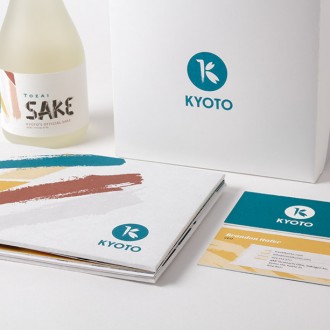
Kyoto Rebrand
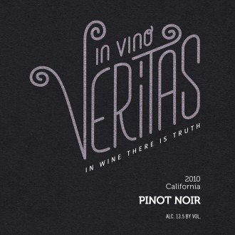
In Vino Veritas

This typographic poster series was a personal exploration of typography, shape, and color.